Zurich UK - Information architecture and responsive design
Zurich UK
Designing, launching and evolving Zurich UK
The challenge
Zurich UK were undergoing a major replatforming of all web properties, this revealed an opportunity to redesign the website and information architecture to better meet customer needs and business objectives.
The outcome
An intuitive customer experience aligned to the rest of the Zurich brand.
Optimised and improved user journeys available across all devices.
A consistent experience across the whole of the Zurich UK website.
Validated key page templates and information architecture IA that balances both business requirements and customer need.
My role
Information architecture
I balanced both business requirements and customer need to design the information architectures for the new website. The IA was tested and iterated on throughout the project.
Design execution
I created responsive page designs for a number of key pages on the Zurich UK website. Iterating after testing towards the final solution.
User testing and analysis
I managed and conducted remote testing of IA structures, key page designs and in person one to one usability testing of the new website. Analysing both quantitative and qualitative data, presenting back findings and the action to be taken.
Stakeholder engagement
I planned and moderated workshop after workshop with Zurich employees representing different parts of the business. Co-designing IA structures and key page designs with them, and conducting exercises to engage them in the product and win their buy in.
One eye on the future
I created a series of storyboards visualising a vision for Zurich to aim towards, a North Star. Storyboard telling the story of complex multi channel journeys, referencing where and how the new digital services on the Zurich UK website will be able to improve customer experience and business efficiencies.

Zurich UK were undergoing a replatforming of all web properties to a single shared platform. A colleague and I were tasked with supporting Zurich UK in redesigning their website to ensure a quality customer experience and consistency with the rest of the global brand.
Analysing and understanding over 800 web pages
The project started by completing a full audit of the current content and producing a sitemap for the as-is website. The sitemap helped us identify gaps in the content and to quickly understand:
What needed reworking
What pages could be grouped together
Navigation issues
Competitor analysis
A best practice review of Zurich’s closest competitors was completed, reviewing the usability, responsive design, navigation and IA.
The review identified what they do well, how they do it and also areas for improvement.

5 key themes were gleaned from the analysis:
1. Give the customer an option to select what type of customer group they fall into (personal, business etc) it's a useful routing tool to products and services applicable to their needs
2. Keep the labelling simple - Use human language, not insurance jargon. Don’t make the customer think
3. Don’t over do the labels in the navigation - No more than six
4. Don’t under do the labels in the navigation - Don’t make it hard for the customer to find what they require
5.Simple and easy to navigate menus - Use subtitles where applicable so the user can scan and pick out what they need
Stakeholder workshops
Stakeholders representing various business units within Zurich were brought together in a series of workshops.
Zurich UK is large organisation, covering lots of products and other service offerings to customers. It was important to speak with as many units as possible to understand their perspectives and ideas for the IA and page designs. After all, one Zurich UK website would have to work for all.
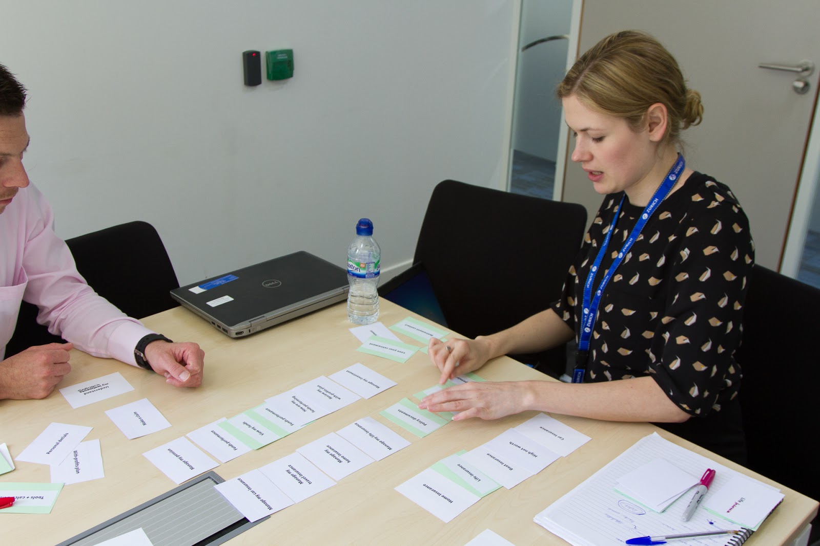
I designed and moderated the workshops, in which I led co-discover and co-design exercises with the stakeholders to glean IA ideas and hypotheses, and also work with them to produce lo-fi page designs.

Stakeholders had great existing customer insight that they used when creating their IA and page designs.
Observing and assisting during the exercises my colleague and I gathered many insights into customers which we could use to inform our design work going forward.
IA testing and iterating
The different IA hypotheses were reviewed and iterated further before taking them into Treejack testing with customers.
During a two week period over 300 potential customers tested nine variations of the IA. The participants were given tasks to complete and then had to locate where they would expect to find the answer to their task. For example:
Select the page you would expect to be able to renew you car insurance from
Select the page where you would expect to be able to get a Life Insurance quote
Select the page where you would expect to be able to apply for a graduate job
During this two week activity we were constantly reviewing the incoming data, iterating and trying new IA structures. Experimenting with different labels, the way groupings were phrased, overly simple language, more product language and so on.
Lots of great insight was uncovered and we whittled down the IA to three that tested particularly well.

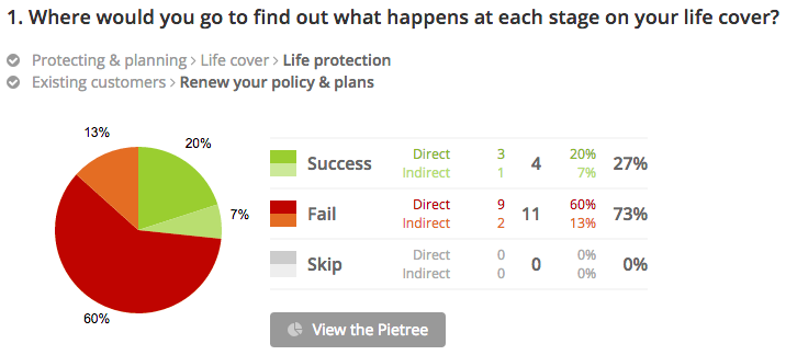
Quantitative data from one of eight tasks customers and non customers were tasked with
Prototyping
Treejack testing gave a good understanding of the what. The what being what IA and labelling worked and what didn’t.
However, we wanted an understanding of the why, we needed qualitative data to validate our hypotheses. With that objective in mind my colleague and I created a responsive prototype that Zurich and non Zurich customers tested remotely.
The prototype gave the IA and navigation more realism during testing with customers and stakeholders. We also used the prototype to test the design of key page templates, using real content, they were:
- Home page
- Product pages
- Quote pages and flow
- Existing customer log in area


Prototyping information architecture
We recruited participants who:
Bought Car, Home or Life insurance online in the past 12 months
Renewed their Car, Home or Life insurance online in the past 12 months
Made a claim against their Car, Home or Life insurance online in the past 12 months
Were existing Zurich UK customers
This was my first time conducting remote testing and the main reason we did was due to budget constraints. I would always opt for in person testing with customers. But given the project restrictions we working in we pressed on. We used WhatUsersDo and after a few attempts we had a successful process working well.
We were able to watch user testing videos in the morning and extract the insight and pain points. Then we would iterate the IA and prototype, and set everything up for another round of remote testing. This included questions to be asked, tasks to complete and uploading of materials.
The prototype then got tested that evening and overnight. Greeting us in the morning were fresh user testing videos and data ready for us to review. Constant testing and iterating.
“I analysed the user testing videos in the morning, iterated the prototype in the afternoon and set up another round of remote testing to be completed in the evening.”

WhatUsersDo remote user testing video preview screenshot
Output and outcome
Mine and my colleagues involvement finished with handing over to the Zurich UK team a validated information architecture, validated key page templates and content guidelines to follow during the creation of the site. The assets and documentation guided the Zurich site editors during the build of the Zurich UK MVP website.
Achieved through working collaboratively with a diverse stakeholder group, constant customer involvement and testing and iterating throughout.

IA Levels 1, 2 and 3


Key page templates

Follow up
In the following months the Zurich UK team took our page templates, components and strategy and built the MVP of the website using a CMS.
Zurich then reengaged with WAE and I was tasked with leading and conducting twenty 1 to 1 in person user testing sessions with existing and potential customers, testing the MVP, over 3 days.

Moderating user testing of the Zurich UK MVP website
I compiled my findings and presented back to the team:
Key insights
Short term page design changes and recommendations
Long term strategic design recommendations for the future of Zurich.co.uk
Future Zurich.co.uk experience
My involvement with Zurich UK didn’t end there.
Over a month I created a series of storyboards visualising a vision for Zurich showing the potential the website has to improve customer experience and organisation efficiencies. The storyboards cover user journeys that currently take place and future journeys that the website could enable.
The storyboards sat alongside the website to make the vision more tangible. They were also used as a tool to get buy in from senior stakeholders within Zurich UK.

1 of 5 storyboards I created visualising the Zurich UK vision